Master CSS Position - Plain Explanation.
Switching up positions for you? 😆


When I started out in Web Development, I struggled with CSS positions. Honestly, I used to avoid it and used Flexbox or grid for layouts. I was unaware of the potential of the Position properties. But, when I finally understood how it was used. CSS has become more fun. 🌟
By the end of this blog, you will master the CSS positions and style layouts confidently. 🚀
Scope Of This Mini-Blog 👨🏫:
- CSS position property Usage.
- The most commonly used position explained, in the most simple terms.
- Links to Web IDE, for trying out yourself after understanding.
What is the CSS Position property used for?
The CSS position property is used to define the position of an element in a webpage. With CSS positions and by setting the top, left, bottom, right attributes, we have total control in deciding the final position of any element in a webpage.
The Most Commonly used CSS positions are :
- Static
- Relative
- Absolute
- Fixed
- Sticky
Without much complications, let us get straight into each of the positions. And by the end of this, you will be a master in using CSS positions.
Static:
HTML elements are static by default. They are unaffected by the top, bottom, left, right.
Fixed and Sticky are pretty much self-explanatory by their names. However, a lot of new programmers, really struggle with the first two positions, and how and where to use them - Relative and absolute. 😢
Relative
Relative position means, the element will be positioned relative to its normal position. However, the element will remain unaffected unless we specify the top, left, bottom, or right. For, example: Consider a normal Heading. The Heading has a width of 80%. And aligned left. With no margin, initially. If we set its position relative and specify left: 3rem. The header will be now be positioned left of its original position by 3rem. That is, the header will be shifted towards the left by 3rem. And will have a margin of 3rem. But, as you guessed it, the relative position, alone, does not make much sense.
Absolute
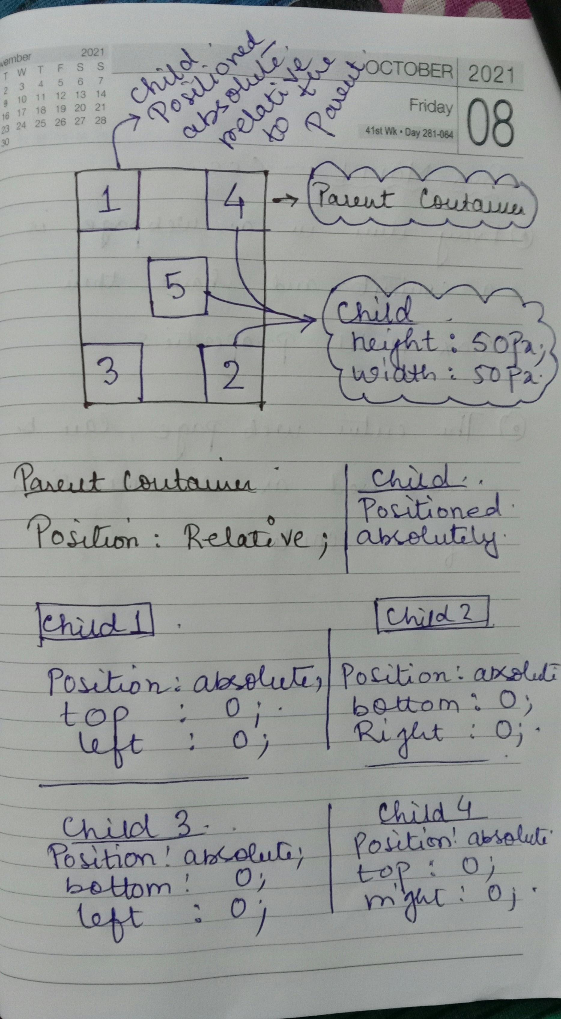
Absolute elements are positioned relative to the parent container(Provided the parent container is relatively positioned). If no parent container is specified, the absolute elements are placed relative to the document body. To use positon absolute effectively, it is necessary to wrap it around a wrapper container (or parent container) and positon them relatively. By doing this, & specifying the top, bottom, left, right of the absolute element, we can specify the final position of the element inside the parent container.
An absolutely positioned element doesn't any longer exist in the actual document flow, instead, it has its own layout, separate from the rest of the document.
Here’s an interesting analogy: Let us consider a table, which is equal to our document. And have a table cloth covering 80% of it, which is positioned relative(wrapper) And now we can place items on the cloth however we want by setting the positions of the elements as absolute and specifying its top, left, bottom, right.
For example :
- By specifying the bottom : 0; => of absolute elements inside a relative container, the element will be placed at the very bottom, inside the container.
Similarly,
- left : 0; => of an absolute element inside a relative container will position the element inside the parent container at its extreme left.
In other words, by having a relatively positioned container, we can position absolute elements however we want, by specifying the top, bottom, left, right attributes.
Here's one of my hand-drawn diagrams for a better understanding of how Relative & Absolute positions can be used effectively to design layouts.
Fixed
Elements with a fixed position, are positioned relative to the viewport. It stays at the same place even if we scroll the page. By specifying the top, bottom, left, right, we precisely fix the element’s position on the web page. It doesn’t change and is fixed at the specified position, hence the name.
Sticky
Elements with sticky positions are placed relative to the scrolling behavior. It is similar to fixed, but only after the user has scrolled past a specified viewport. We can define that by defining the offset. The element is initially positioned relative until the user scrolls past the offset position, then it sticks to a place(like fixed), and hence the name.
Conclusion
CSS is just a matter of practice and trying things out for yourself. The more you practice, the better you get at it. Understanding the functionality is not enough until you put them into practice. ✨ Consistent little practises can make you feel more confident 🚀
You can read more about css properties, on one of my favorite websites 🎉
This is in continuation to my Web Development blog series. 🕸🏋️♂️ If you are new to Web Development, you can check out the parts of this series too. The contents are kept effectively simple and completely beginner-friendly 🤝
Links to related articles. 🧙♂️🛸
Have a wonderful weekend ahead. 🎇🎉🎊