
Introduction: The absolute guide to styling webpages.
Get ready to master CSS 🎨


But What do you mean by styling webpages?
We know right, all webpages contain elements that form their information architecture? All those are the elements of the webpage, that we want to style in order for a better visual representation.
Sorry, but we don't know what elements are you talking about?
Anything in the webpage, be it the paragraph element , the navigation space, footer, section elements, image element, video element, and so on. Those are some examples for a better understanding of the element concept. We style the elements in the way we want them on the website.
Hey but, how can we style them? What are the ways to style a webpage?
Presenting the website is all about creativity and providing a rich and smooth user interface, that will attract the user.
To understand better , let us understand the box-model first.
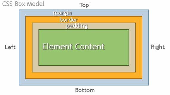
Remember the HTML elements? Now it is clear for you.
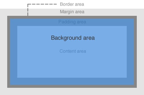
All the elements are considered to be a box with their own border , margin and padding. This is called the CSS BOX-MODEL. Understanding the CSS BOX_MODEL is important because it makes the rest of the understanding easier. We can style the elements of a webpage in any way, we want. Some of the examples of styling webpages are , adding appealing colors , animations , different fonts, different pattern and presentation of the elements and more.
Where do we style the webpage? Do we have to remember a lot of codes and properties?
CSS stands for Cascading Style Sheets. They govern the visual representation of the HTML elements. CSS is also another markup language , just like HTMLbut it describes the presentation of a document.
The most interesting part about CSS is that , there are not much properties we have to memorize. All the properties we use to manipulate the Document is directly related to their function. We will understand them with examples,in the later portion.
Let us take an example, with code snippets.
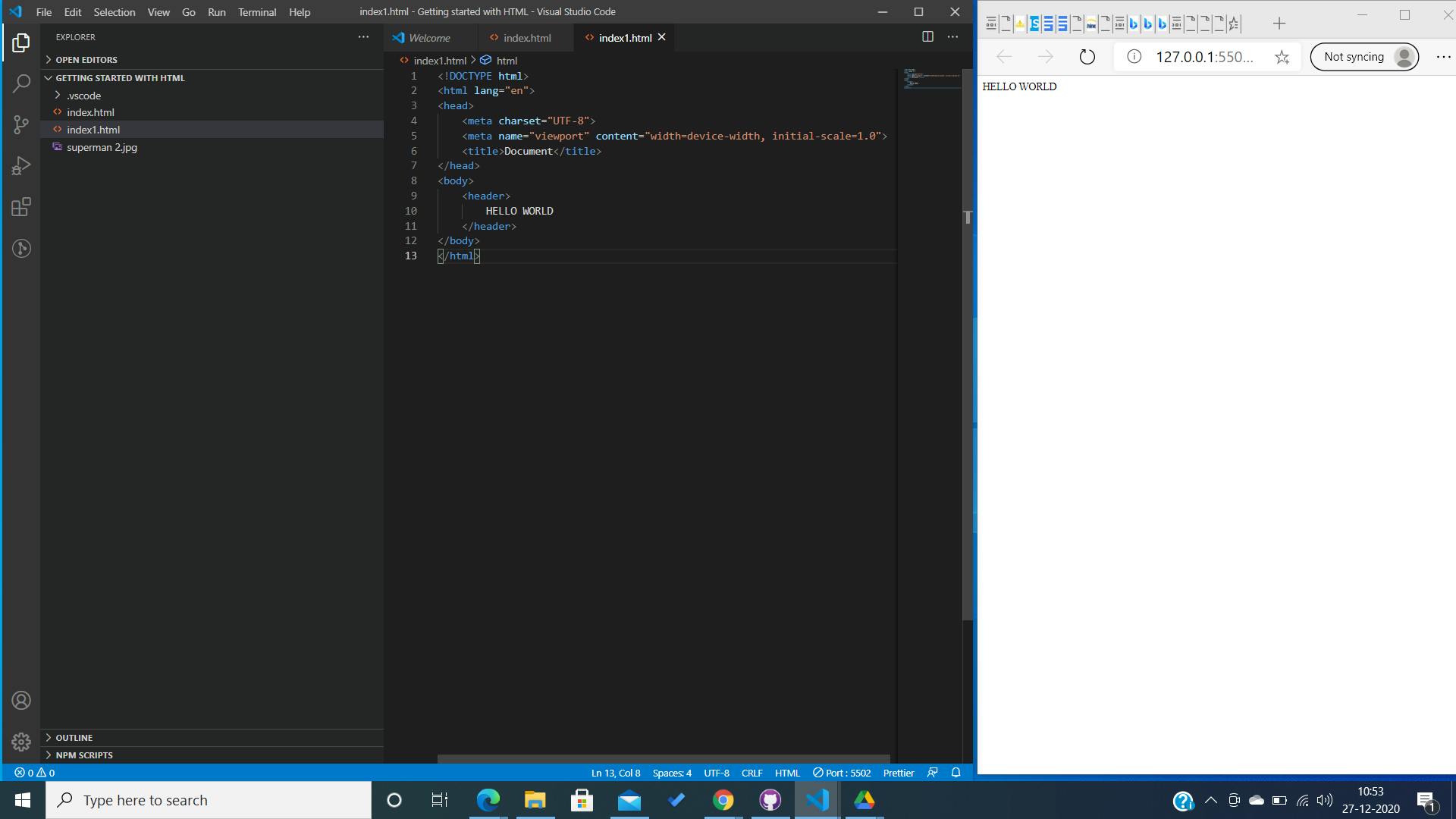
This is just a plain HTML. This is just an example to understand how the styling works.
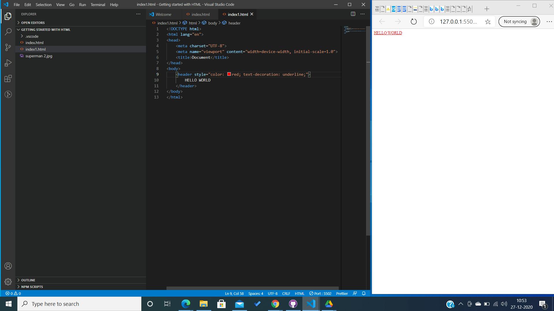
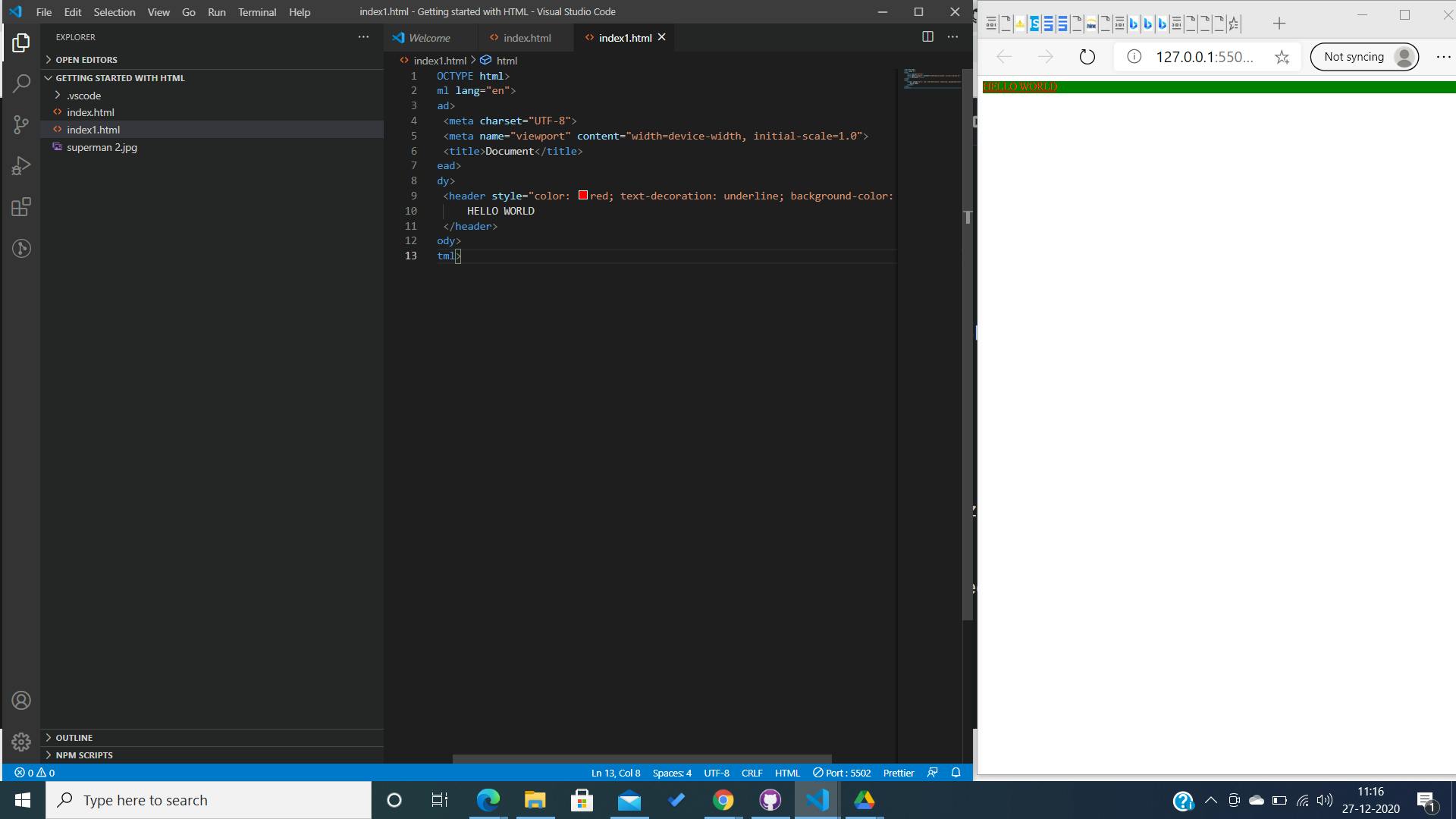
We styled the header by adding a style="..." in the opening tag. We used two properties in here. We changed the color of the text from default black to red and added an underline to decorate the text.
Can you guess the output of the following code snippet?
<header style =" color: red; background-color:green;">
 Hello World.
 </header>
You are right. It will turn out to be something like:
Further, if we want to present at the middle top of the document instead of left side. we use the text-aligh property. It aligns the element in the vertical axis. Therefore, to align the "hello world" at the centre top we use -> text-align: centre;
<header style =" color: red; background-color:green; text-align : centre">
 Hello World.
 </header>
 Further we can add margins , border and padding to the element. Do you see why the box-model is imporatnt to understand.
To check them out add stylings and see how it is rendered on the screen. I will show an example.
Further we can add margins , border and padding to the element. Do you see why the box-model is imporatnt to understand.
To check them out add stylings and see how it is rendered on the screen. I will show an example.
<header style =" color: red; background-color:green; text-align : centre; margin-top: 50%">
 Hello World.
 </header>
Curious, how the browser would read this? Check the picture below.
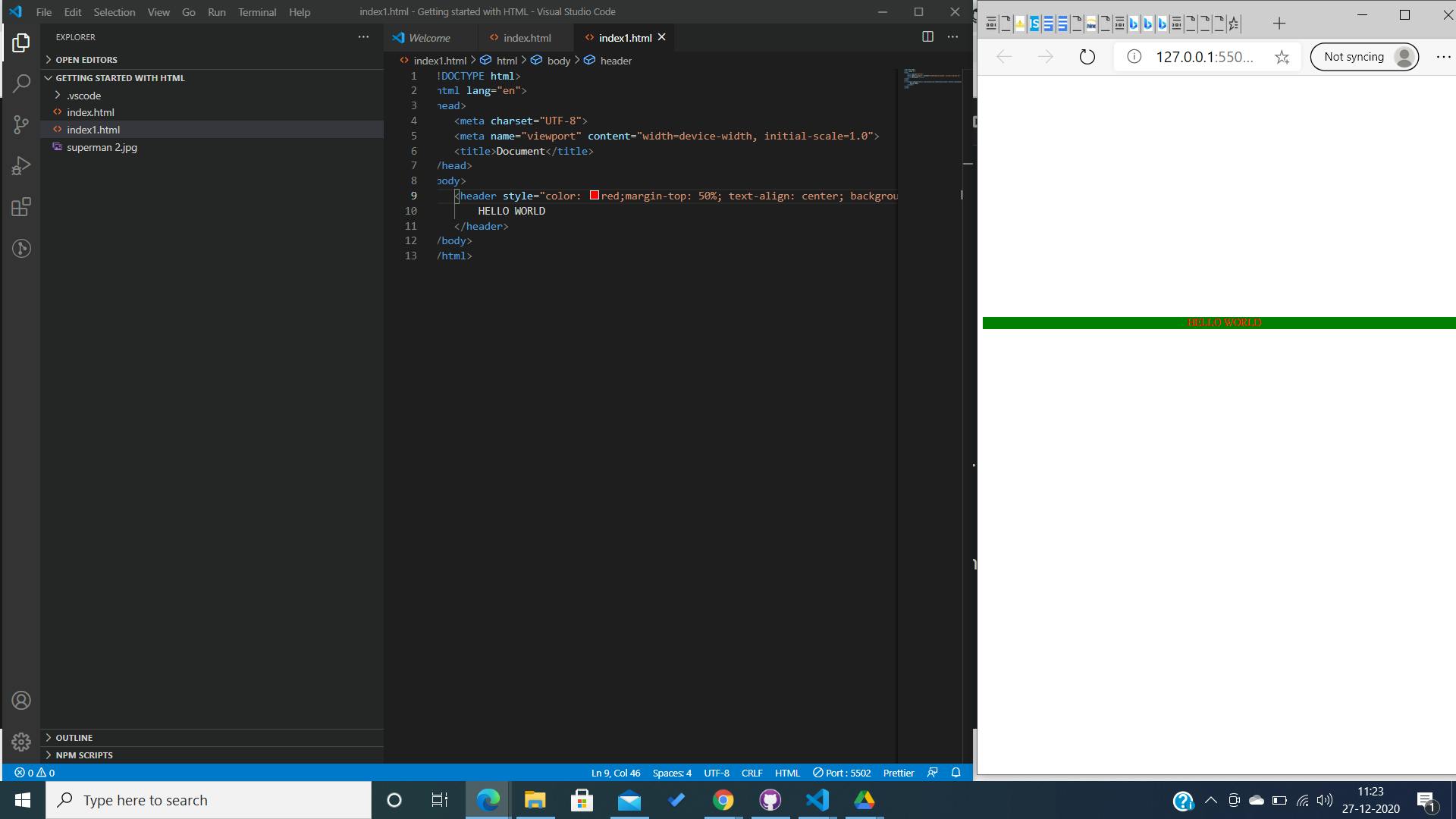 The gap between the text and the top of the page is increased. Why? Because we added a margin of 50%.
Do you notice that most of the properties we used till now are self-explanatory and we know what are their purposes just by their name. There are numerous CSS properties and values. It is almost impossible to talk about each and every one of them in a single blog. The best way to practise is by getting your hands dirty.
Another way of adding style to webpages.
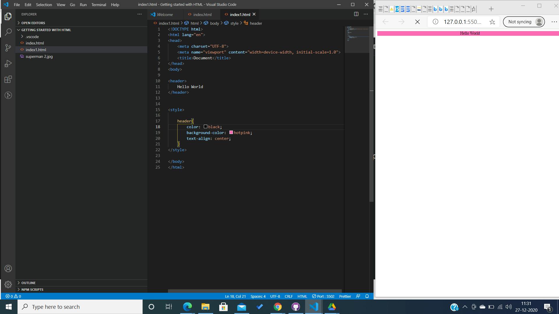
There is another way if styling webpages inside the html flle itself. We will take the same example to understand and see how it works. In this method of styling, we assign the values to the properties inside a style tag in the HTML file itself.
<style>

element {
properties : values;
properties ; values;

</style>
In this code snippet; the element refers to the element we want to style. Look at this picture below for a better understanding.
Using Cascading Style Sheets to style.
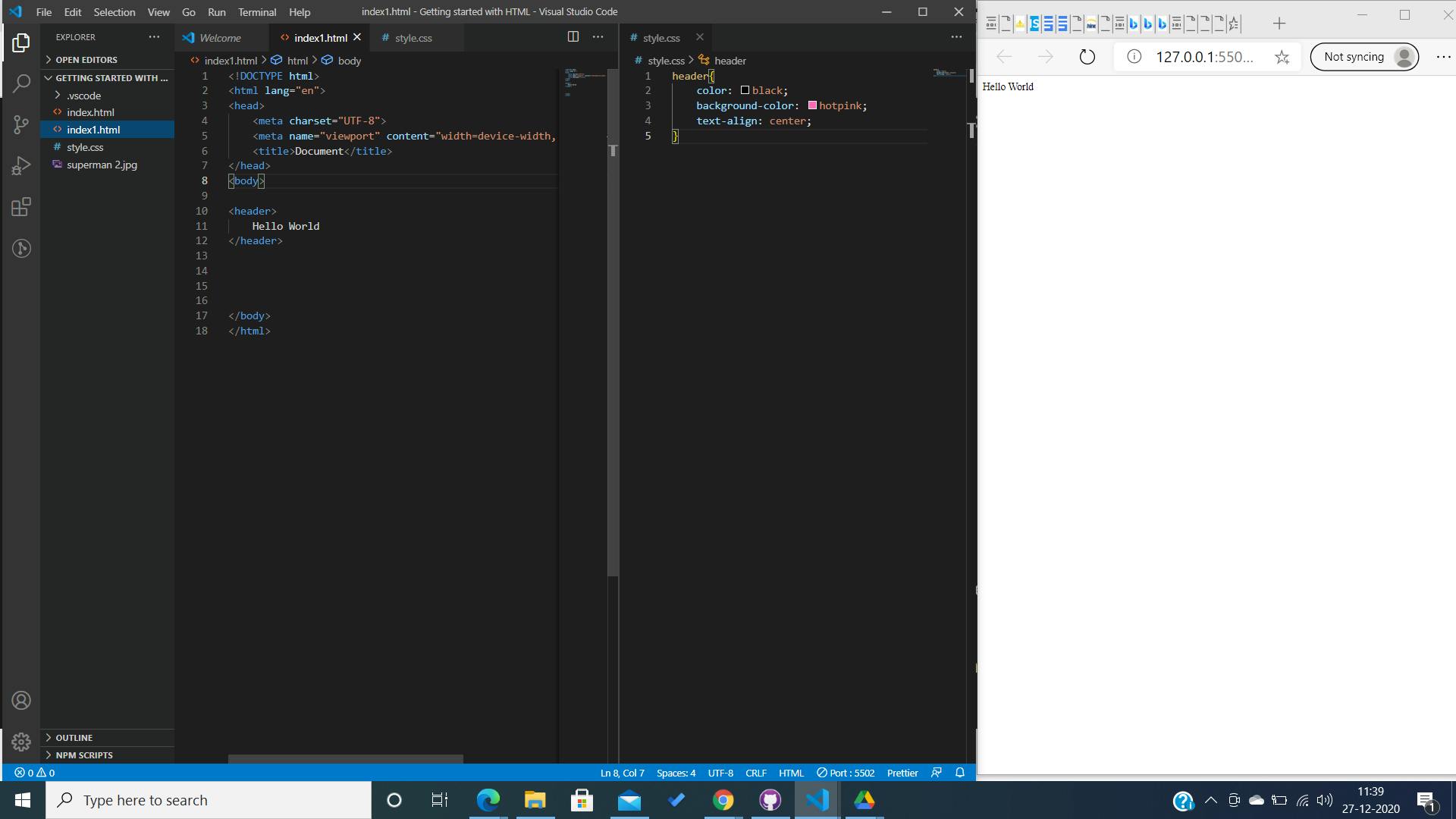
This is most popular way of styling a webpage. In this method of styling, we create a file with an extension of .css like we create an HTML file using .html. And then link the CSS file to the Html file. The CSS file contains all the styling documents. Like we know all the linked files are kept inside the head of HTML. Let us understand the process of creating and linking Style sheets to HTML documents.
 We created the stylesheet and assigned some values too. But the changes are not made on the browser? Can you say why? Yes, you got it right. The style sheet contains the styling documents. But which document are we styling? Therefore the stylesheet has to be linked to the HTML for the changes to rendering.
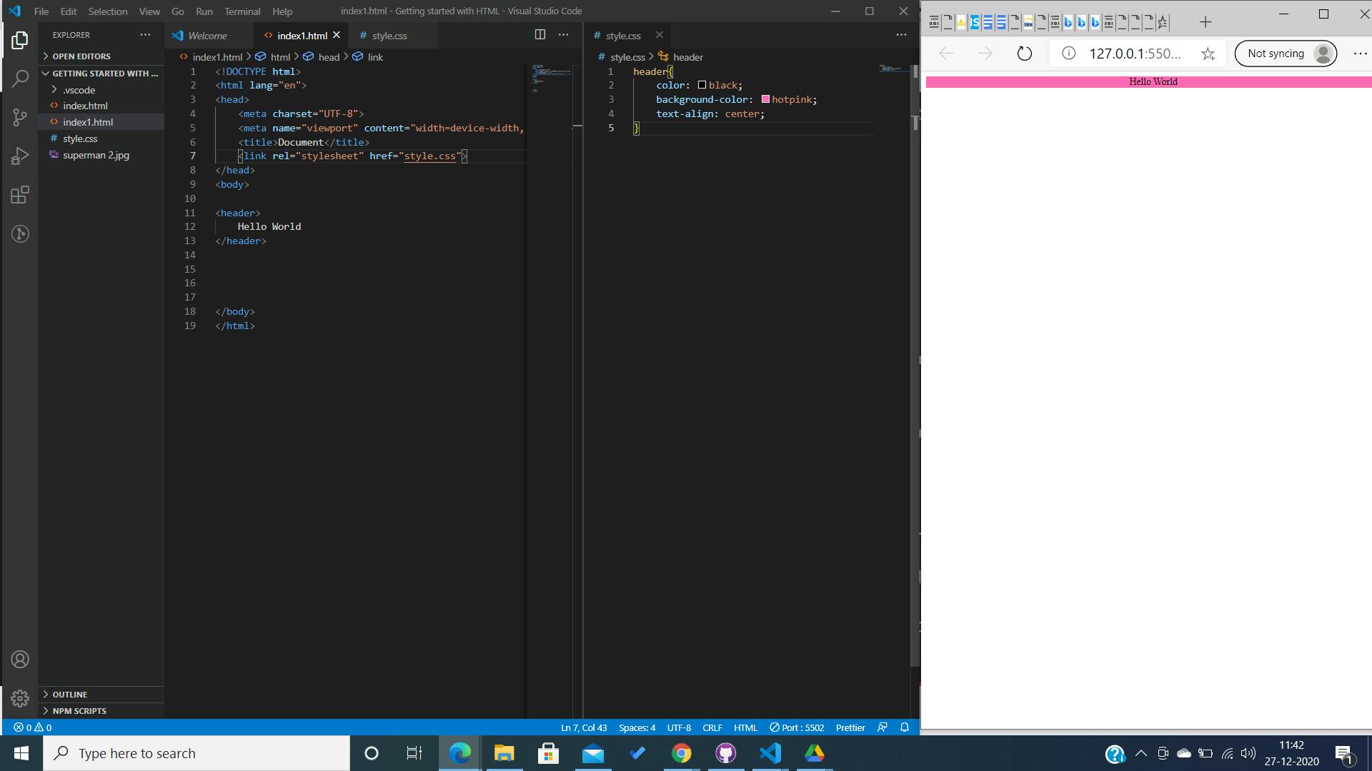
Now, after we linked the stylesheet the changes are taking place.
<link rel="stylesheet" href="style.css">

Syntax of linking the stylesheet to the HTML. Inside the head tag.
With this we are pretty much done with a basic understanding of stylesheets and how they are used.
Before ending, can you please give us a few tips for styling?
Styling is a way of representation. With diverse creativity, there are no hard and fast rules to styling. However, there are a few tips which you could take help of to become e better UI developer:
- Alway design for mobile-first and then scale up. Styling also refers to the dimension of elements and how they are viewed across other devices.
- Try to avoid assigning absolute units to values. Try using "%, rem ,em, px , vh,vw" instead for responsive designs.
- Avoid too much Bootstraps. Understand how CSS works and work your way through it. Dependency on frameworks is not much helpful.
- Use Flex-Box and Grid, the most powerful CSS weapons. Get used to them. We will cover them in the next blogs.
- Get a hang of media-queries. They are not confusing, just a little tricky with the names. Get used to them . They are amazing for responsive designs and the representation of documents across different devices.
- The last thing, always go for asymmetry. Even if you are bad at designs. Have a pattern in mind while styling. Styling doesn't have to be very rich and very heavy it just has to have a rich experience and a clean presentation and easy to use.