


When I started with the web, pseudo-elements were hard for me. But once I got the hang of it, It became super cool to use 🤩. I am still not even near to pro at it.😑 I am still learning. 🤓 And most developers struggle with them, too.
Disclaimer ✨
This is another continuation of my 'Web Development' Blog series. Before reading this blog:
- It is necessary to know about some basic concepts of HTML Elements.
CSS concepts like positions, and Box Model. You can check about them :
- CSS-tricks
- My Hashnode blog series on Web Dev
Before we start, let us quickly go through the scope of this blog.
- ::before & ::after properties explained. 👨🏫
- Salient features of these properties. 🥈
- Live code snippets and outputs to see how they work. 💻
What are ::before & ::after? 🤔
They are pseudo-elements, which are extremely fun to use while styling.
What do I mean by pseudo-elements? 🤔
- They are used to add special effects to elements without using any complex LOCs.
- They also do not exist as a legit HTML element node.
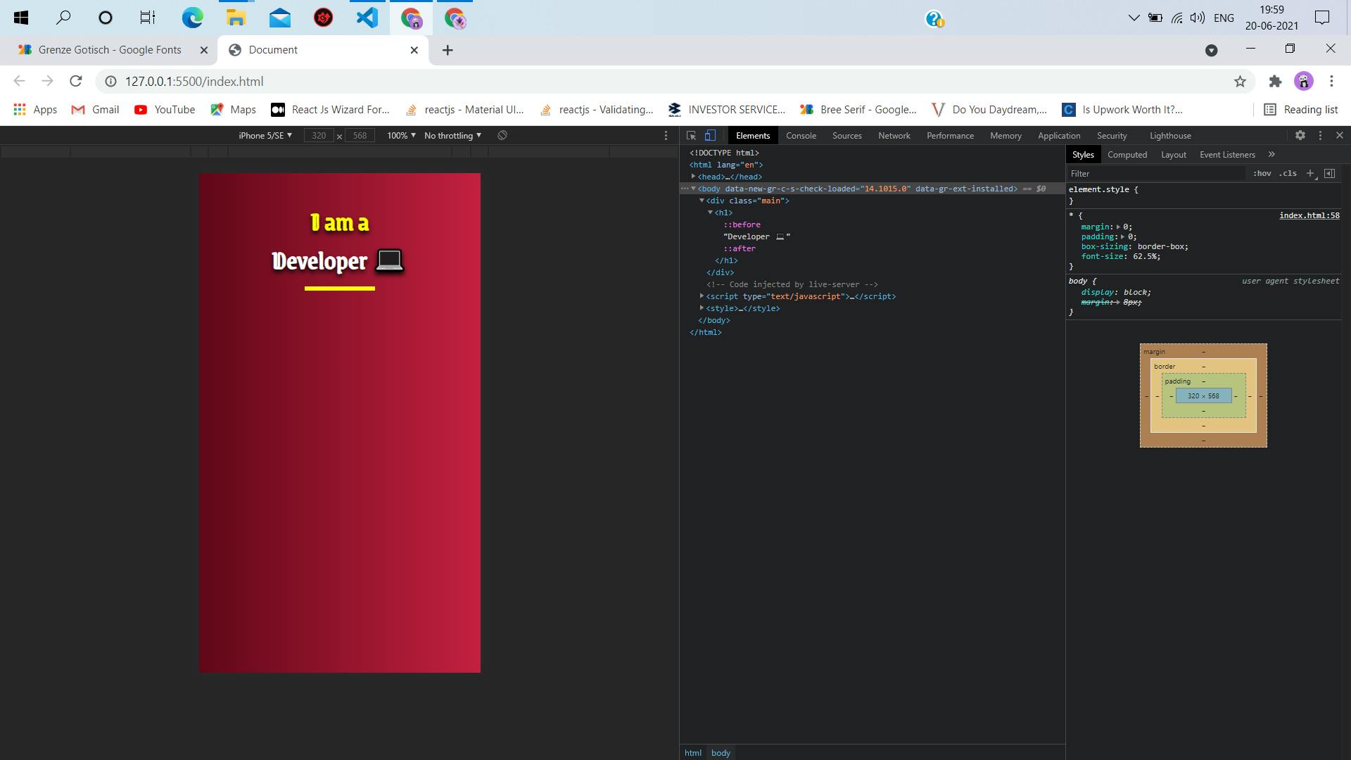
- We will understand the basic concept of before & after by styling the above picture. 😎
- This becomes very evident when you try to select any::before or::after content, you will see they can't be selected in the browser, while every other HTML content can be selected in the browser.
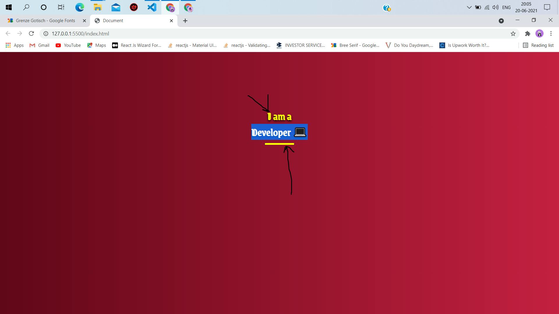
- The 'Developer' text can be selected, as it is a legit HTML element node. But the yellow contents, showed by the distorted black arrow(I am a noob at edits 😪) can not be selected. They are pseudo-elements.
- This also proves, they are not legit elements in the HTML Document Tree. 📃🌳
Salient features to know about pseudo-elements.
- ::before/::after are pseudo-elements and not should not be confused with pseudo-class like :hover.
- The right way to represent pseudo-elements are with double colons =>::
- This syntax was essential, introduced in CSS to differentiate between pseudo-class and pseudo-elements.
- While :before/:after can be used to style , the browser reads both syntax, it is recommended to use double colons => ::before/::after
It is also essential to understand, to avoid any misconception :
- ::before/::after inserts contents before and after of the selector(node element) they are used with.
Points to note about ::before/::after pseudo elements.
The most important property of ::before /::after is the content property. It is pretty obvious, what it means - by the name of it. It defines the content that is to be inserted before or after the selector we are using these pseudo-elements with.
By default ::before/::after contents are styles inline.
What is inline?
Well, this is another basic yet very important concept to know about. Inline, block elements, and styles. I will attach one of my hand-drawn notes 🖼, where I have tried to simplify what they mean, quite literally.
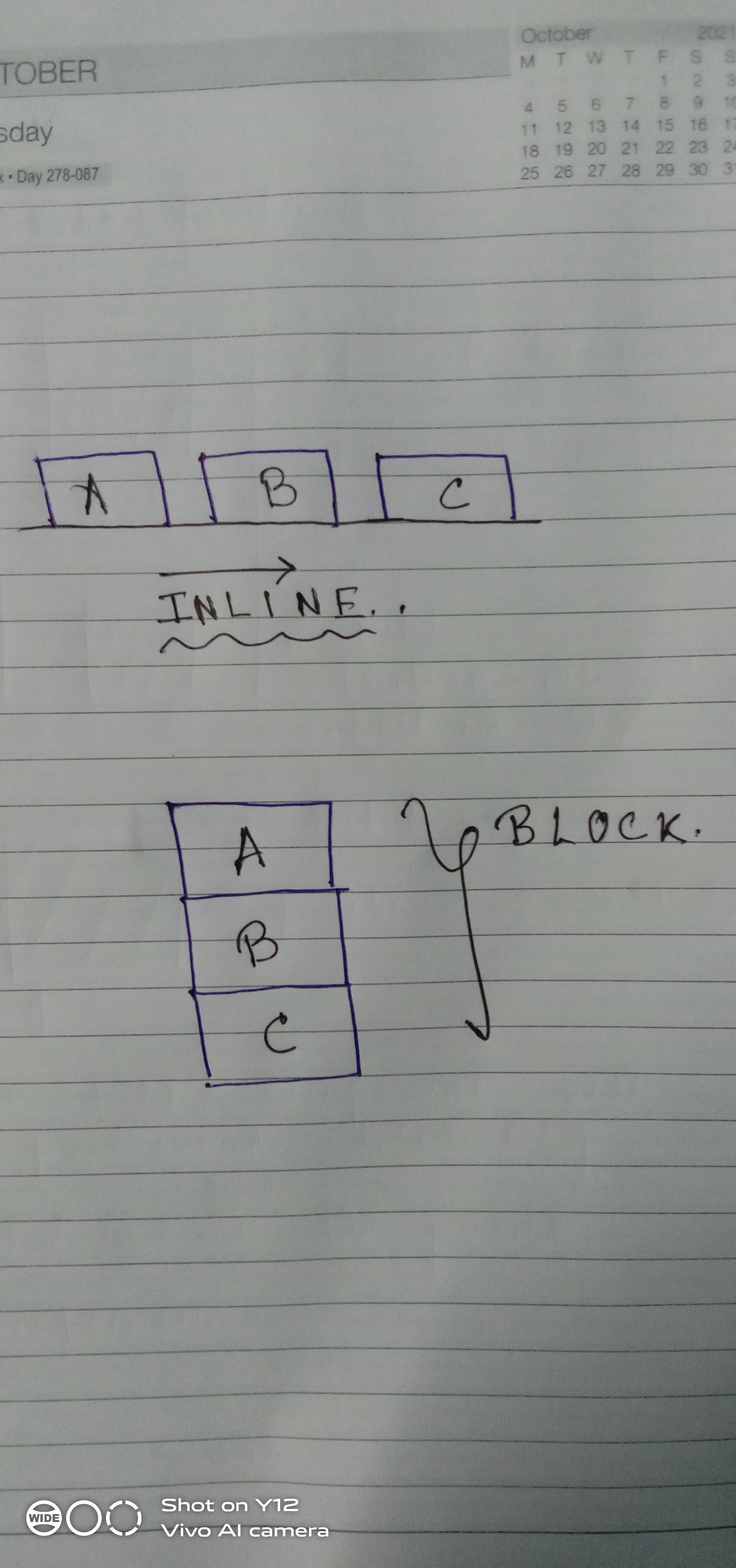 The picture is just A quick gist, and easy to pick the concept of inline & block within few seconds 🦸♂️
You can read more about them in Here
Let us jump into some codes. To know how they work.
We are gonna style a very simple thing, just to understand what is happening. The end result would look like this:
Steps :
Step1
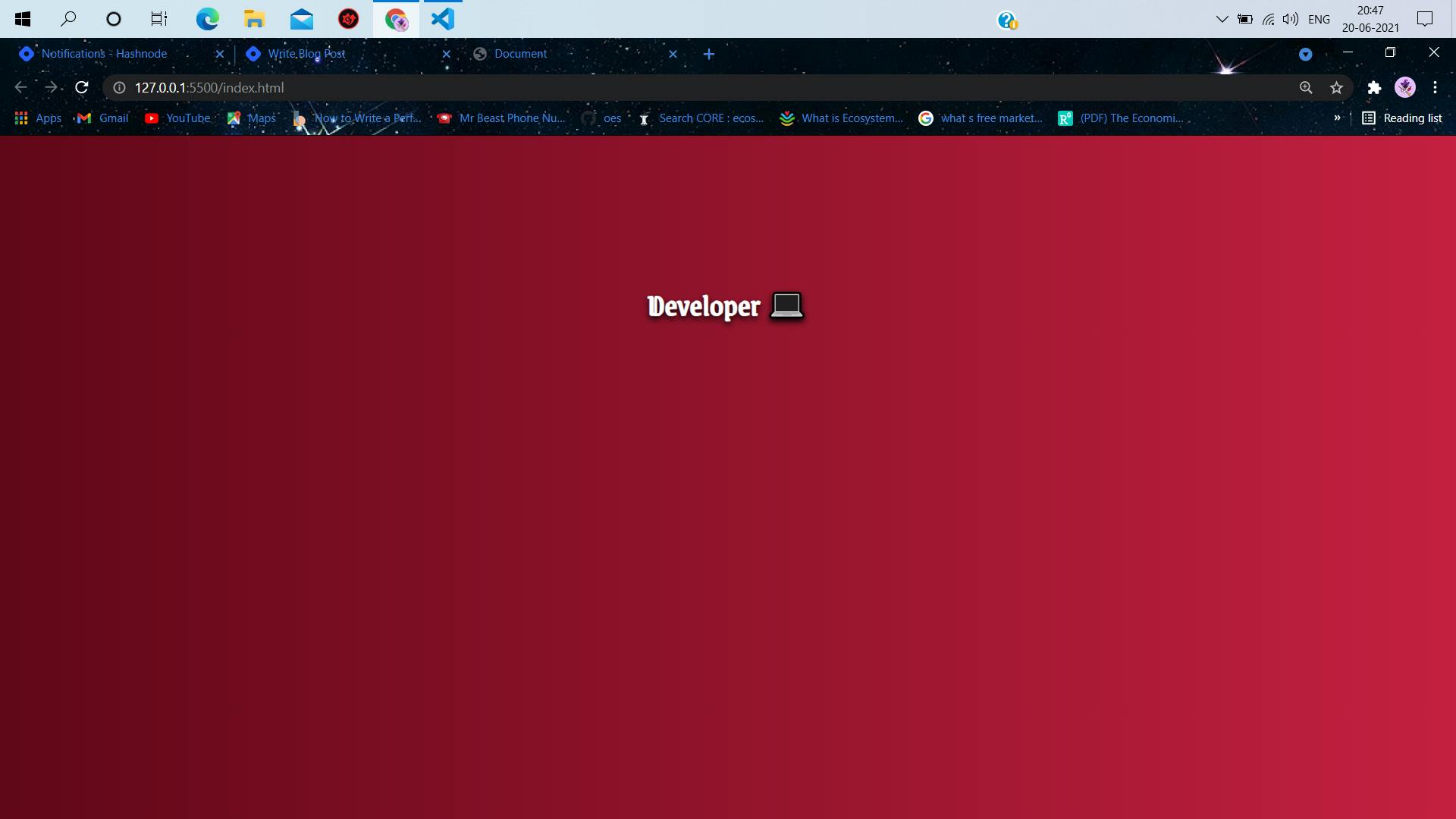
- Create a normal HTML skeleton and use an h1 tag.
<!DOCTYPE html>
<html lang="en">
    <head>
        <meta charset="UTF-8" />
        <meta http-equiv="X-UA-Compatible" content="IE=edge" />
        <meta name="viewport" content="width=device-width, initial-scale=1.0" />
        <link rel="preconnect" href="https://fonts.gstatic.com" />
        <link
            href="https://fonts.googleapis.com/css2?family=Grenze+Gotisch&display=swap"
            rel="stylesheet"
        />
        <title>Document</title>
    </head>
    <body>
        <div class="main">
            <h1>Developer 💻</h1>
        </div>
    </body>


</html>
- In the links, we are using a google font link to use that in the styling.
- In the very first instinct we can create something like the picture, by adding a few more divs or tags above and below the h1. But by using pseudo-elements we can skip adding elements in the document tree. 📃🌳
Step2:
- Add some basic styles to the document to give it a decent look.
<!DOCTYPE html>
<html lang="en">
    <head>
        <meta charset="UTF-8" />
        <meta http-equiv="X-UA-Compatible" content="IE=edge" />
        <meta name="viewport" content="width=device-width, initial-scale=1.0" />
        <link rel="preconnect" href="https://fonts.gstatic.com" />
        <link
            href="https://fonts.googleapis.com/css2?family=Grenze+Gotisch&display=swap"
            rel="stylesheet"
        />
        <title>Document</title>
    </head>
    <body>
        <div class="main">
            <h1>Developer 💻</h1>
        </div>
    </body>

    <style>
        * {
            margin: 0;
            padding: 0;
            box-sizing: border-box;
            font-size: 62.5%;
        }

        .main {
            width: 100vw;
            height: 100vh;
            background: linear-gradient(to right, rgb(97, 7, 25), rgb(197, 32, 65));
            padding-top: 10%;
        }

        h1 {
            font-family: "Grenze Gotisch", cursive;
            color: white;
            position: relative;
            text-align: center;
            text-shadow: 0px 3px 6px black;
            font-size: 3rem;
        }
        </style>


</html>
- We added some global styles to the document to override the user agent stylesheet. BY setting te=he margin & padding to 0.
- Added bit of styling to the div of class man and the h1.
It would look like :
Step3
- Now the fun part
h1::before {
            content: "I am a";
            color: yellow;

        }
can you guess the output? Let us see,
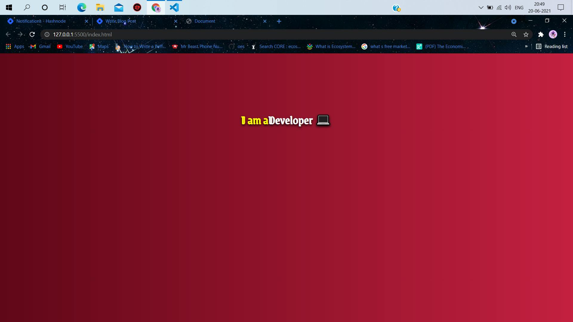
- Notice, how using ::before => the content is styled just in front of the selector content? and is inline with the element.
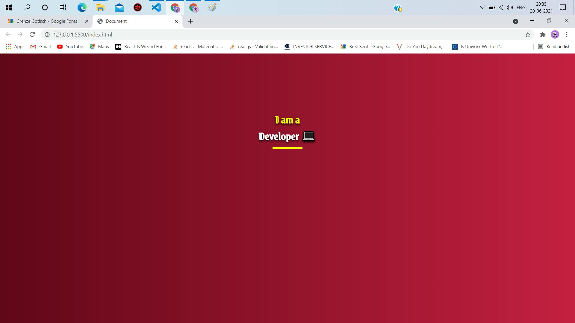
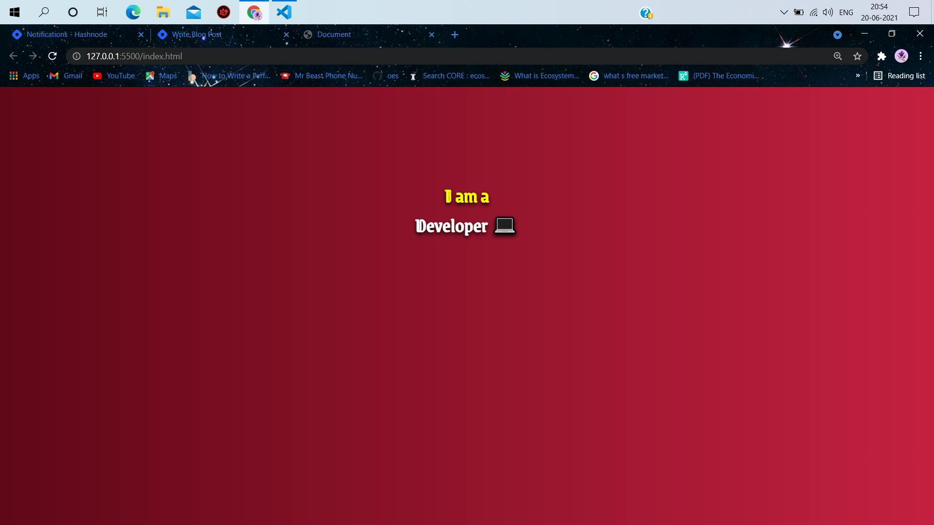
Let us change the display of the before content to block to give it a block view.
    <style>
        * {
            margin: 0;
            padding: 0;
            box-sizing: border-box;
            font-size: 62.5%;
        }

        .main {
            width: 100vw;
            height: 100vh;
            background: linear-gradient(to right, rgb(97, 7, 25), rgb(197, 32, 65));
            padding-top: 10%;
        }

        h1 {
            font-family: "Grenze Gotisch", cursive;
            color: white;
            position: relative;
            text-align: center;
            text-shadow: 0px 3px 6px black;
            font-size: 3rem;
        }
        h1::before {
            content: "I am a";
            color: yellow;
            display: block;
        }
    </style>
The changes now after changing the display to block: ✍
Step4
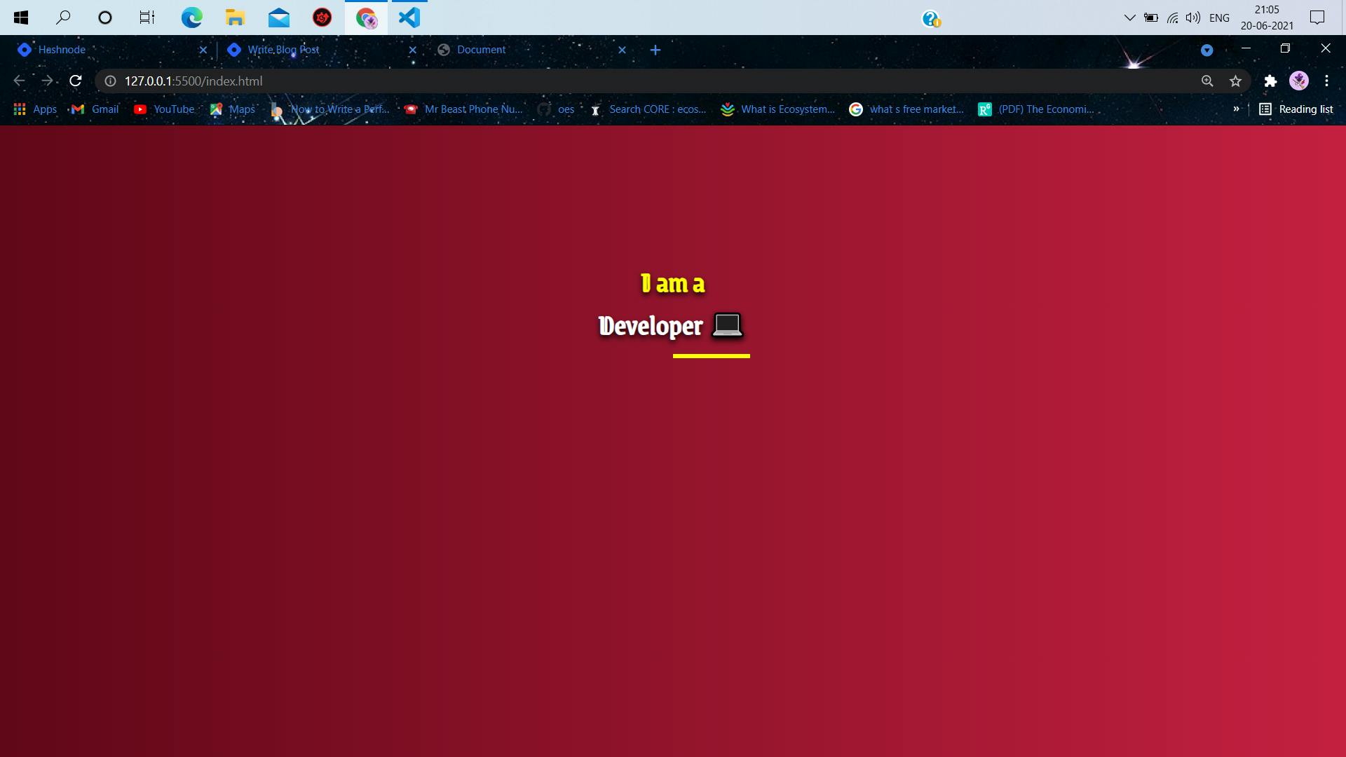
- Add the thick underline using ::after
h1::after {
            content: "";
            color: black;
            position: absolute;
            border-bottom: 5px solid yellow;
            width: 8rem;
            bottom: -15%;
            left: 50%;
        }
- It is necessary to have the idea of positions to understand what is happening here. We are styling the h1::after absolutely relative to the h1.[the h1 has a position: relative] if you have observed previously. You can read more about positions here
The output of the code?
Step 5
- Work is almost done, we just need to center the bottom yellow underline. We can do that using one line of css code.
    h1::after {
            content: "";
            color: black;
            position: absolute;
            border-bottom: 5px solid yellow;
            width: 8rem;
            bottom: -15%;
            left: 50%;
            transform: translateX(-50%);
        }
- By transform :translateX(-50%) =>We translate the content along the X-axis by -50%.
Voila & output 🎉:

- That is pretty much it. It was a very basic example, just to understand how these pseudo-classes work and can be used to style without inserting unnecessary elements in the HTML code.
The entire code 💻:
<!DOCTYPE html>
<html lang="en">
    <head>
        <meta charset="UTF-8" />
        <meta http-equiv="X-UA-Compatible" content="IE=edge" />
        <meta name="viewport" content="width=device-width, initial-scale=1.0" />
        <link rel="preconnect" href="https://fonts.gstatic.com" />
        <link
            href="https://fonts.googleapis.com/css2?family=Grenze+Gotisch&display=swap"
            rel="stylesheet"
        />
        <title>Document</title>
    </head>
    <body>
        <div class="main">
            <h1>Developer 💻</h1>
        </div>
    </body>
    <style>
        * {
            margin: 0;
            padding: 0;
            box-sizing: border-box;
            font-size: 62.5%;
        }

        .main {
            width: 100vw;
            height: 100vh;
            background: linear-gradient(to right, rgb(97, 7, 25), rgb(197, 32, 65));
            padding-top: 10%;
        }

        h1 {
            font-family: "Grenze Gotisch", cursive;
            color: white;
            position: relative;
            text-align: center;
            text-shadow: 0px 3px 6px black;
            font-size: 3rem;
        }
        h1::before {
            content: "I am a";
            color: yellow;
            display: block;
        }
        h1::after {
            content: "";
            color: black;
            position: absolute;
            border-bottom: 5px solid yellow;
            width: 8rem;
            bottom: -15%;
            left: 50%;
            transform: translateX(-50%);
        }
    </style>
</html>
Conclusions ✍
Css pseudo-classes are extremely useful or stylings, they are powerful and fun to use once you get the hang of it. It is necessary to use them and try making fun things to get better at them.
As usual I have tried to keep it as beginner-friendly as possible. Hope this was helpful.🤗

A quick recap:
- Pseudo-elements are not part of the actual HTML Document tree. 🌳
- Pseudo-elements make styling easier, without having to insert unnecessary elements node in HTML. 👌
- The correct syntax of representing them is with double colons. 🌞 E.g => h1::after{}
- the content property is the most important property in pseudo-elements. ♨
- The content specifies what is to be inserted. ✍
- ::before / ::after inserts the content just before and after the content box of element on which we are applying the pseudo-elements. 🏖
- By default, pseudo-elements are inline elements. 🅰🅱
- To style more effectively, we need to set the position of the parent(*in this case, the element on which pseudo-elements are applied) relative and set the positions of the pseudo-elements absolute. ⭐