

Hello Readers! 🤗 This post is in continuation of my Blog Series of Web Development. Today, we will learn the very essentials of Grid, in Plain English.
CSS Grid is comparatively very easy to Understand, apply. We have already learned about flexbox in the last topic. Don't worry if you have missed that out, We will go through all of Grid's essentials independently here in this article.📃 You can check about flexbox here
Before we jump onto the article, let us go through the scope of this article :
- What is CSS Grid? 🍫
- Why should we use it? 🤔
- Most Common Grid Properties. 💻
- Recommended resources to get more knowledge on CSS Grid. ⭐⭐⭐⭐⭐
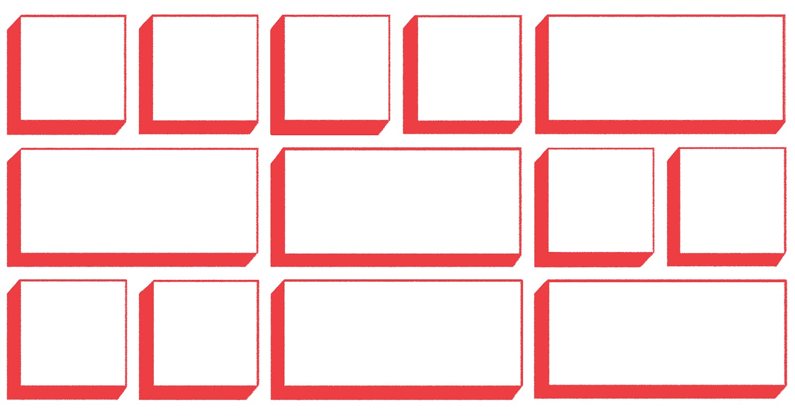
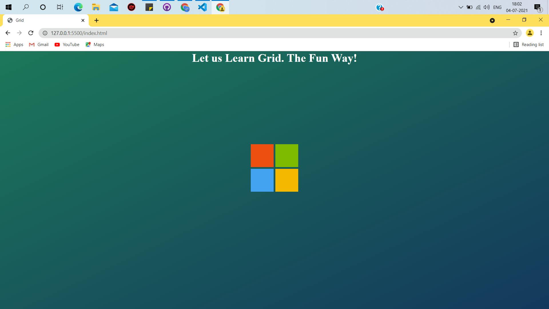
- A Fun Hands-On Task to test our learning - by building a cool Microsoft block logo, like 👇
- Code snippets of the task with explanation (in code comments) 👨💻
- Embedded IDE for you all to play with grid a little. ☘
- Recap 🎓
Below picture is the design we will develop today, applying Grid properties, whatever we learn from this article. 🖼

What is CSS Grid Layout?
- In CSS, Grid Layout is yet another method to control web page layouts/visual design, besides The Box Model , CSS Flexbox
- It typically divides the entire web page into a grid 🍫 to make consistent designs across the browser & giving the developer more control over the design, flow of the elements in the web page.
- It follows a grid-based layout consisting of rows and columns - which makes styling easier without using floats or complex CSS positioning properties.
Why Should we use CSS Grid? 🤔
- Grid helps in creating complex, responsive, high quality, and highly customizable design layouts.
Most common Grid properties. 🎨
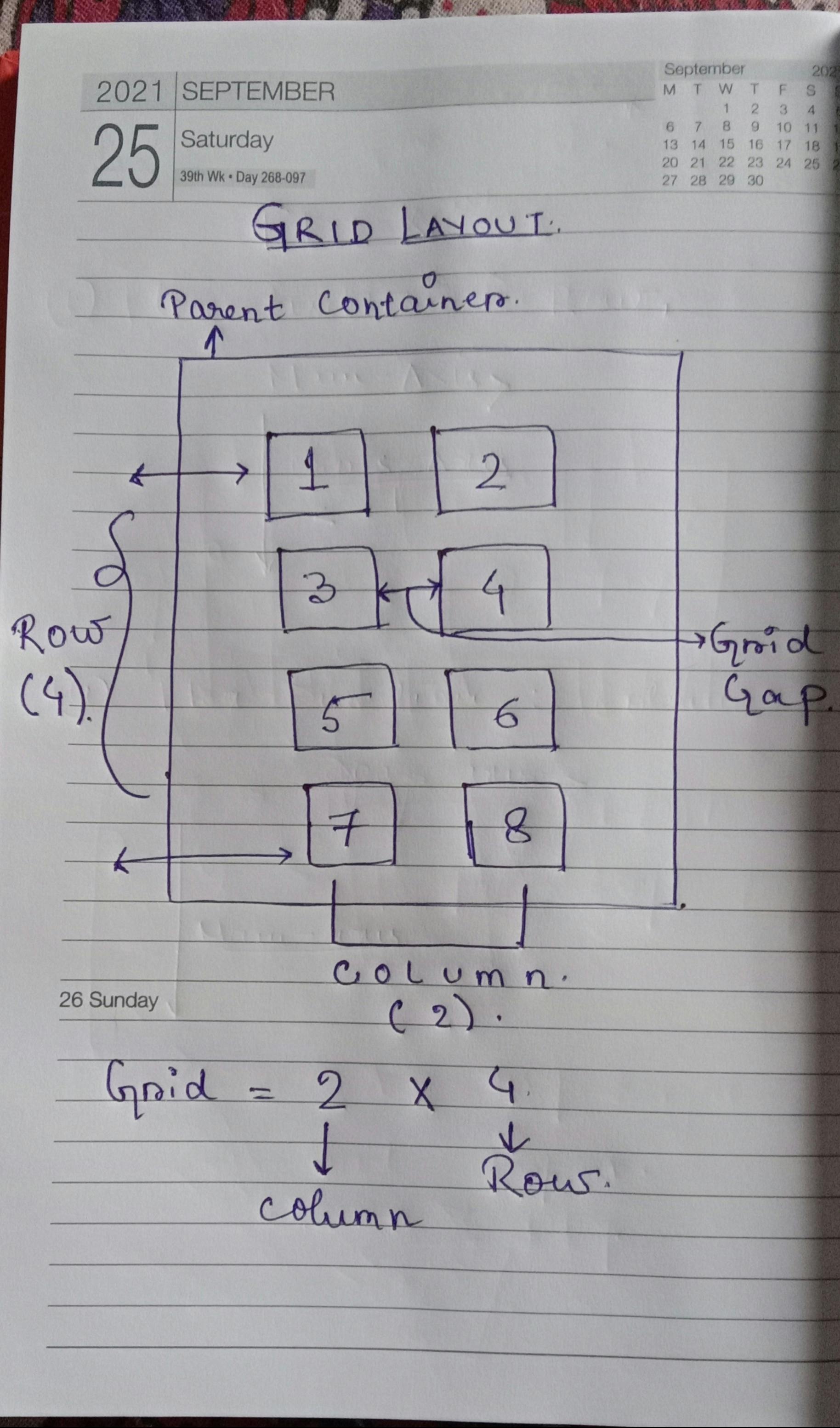
- Gird Layout includes a parent container, which wraps all the elements inside.
- We can easily apply grid layout to them by specifying display: grid; to the parent container.
- In this section, we will learn the most used properties that are applied to the parent container.
Here's a quick note to understand Grid in short. ✍
1. Display
- To apply flexbox styling, we need to set the display property to flex.
.container{
display : grid;
}
2. grid-template-columns / grid-template-columns
- This property specifies the number of columns or rows the container is to be divided into.
- Besides the number of columns/rows it is also used to specify the width of the columns and the height of the rows. Let us understand the syntax properly with a code snippet
.container{
display : grid;
grid-template-columns:  60px 60px;
grid-template-rows: 40px auto 40px;
}

/*
means:
The grid container will have :
- 2 columns with 60px width
- 3 rows of height 40px, auto ,40px;
- auto: sets the dimension to the maximum space that is available to take up.
*/
3. grid-gap
- By the name of it, it is obvious what purpose this property serves. Yes! You guessed it right. 🎉 This property is used to set and specify the gap between grids.
We can also set the grid gaps between columns and rows independently using the property :
- grid-column-gap : defines the gap between grid columns.
- grid-row-gap: defines the gap between grid rows.
4. grid-columns / grid-rows
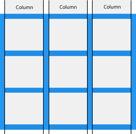
- The vertical lines ( | | | ) of grid elements are referred to as grid columns.
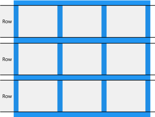
- The horizontal lines of grid elements are referred to as rows.
5. Aligning items inside the grid container:
5.a) justify-content
- This property is used to align all the grid elements inside the grid container along the X-axis of the container. The possible values it takes are :
- start: aligns the items at the start of the container.
- end: aligns the items at the end of the container.
- center: aligns the items at the center of the container.
- space-between: aligns the items so that the columns are spaced out.
- space-evenly: aligns the items in a way where the columns are evenly spaced.
5.b) align-content
- This property is used to align all the grid elements inside the grid container along the Y-axis of the container, i.e, vertically. The possible values it takes are :
- start: aligns the items vertically at the start of the container.
- end: aligns the items vertically at the end of the container.
- center: aligns the items vertically at the center of the container.
- space-between: aligns the items so that the rows are spaced out.
- space-evenly: aligns the items in a way where the rows are evenly spaced.
Note : In order for align-content to take effect, the grid container has to have a height bigger than the grid elements. If there is not enough space(height) no changes would be visible. In other words, for any changes to take place along the vertical axis, the height of the parent container has to be bigger.
There are various other properties that can be applied to each grid element to style them. Not all of them are often used, but knowing them is always a good start.
Some of my recommended places to sharpen your CSS Grid knowledge & skills: ⭐⭐⭐⭐⭐
- w3schools : grid-intro
- w3schools : grid-container
- w3schools : grid-item
- You can refer to them and a complete guide to CSS Grid on css-tricks
Now, the fun part => hands-on application of whatever we have learned so far, in this blog! 🤩
What will we design?
Steps
1. Create the HTML skeleton and link the css, if using an external stylesheet.
<!DOCTYPE html>
<html lang="en">
    <head>
        <meta charset="UTF-8" />
        <meta http-equiv="X-UA-Compatible" content="IE=edge" />
        <meta name="viewport" content="width=device-width, initial-scale=1.0" />
        <link rel="stylesheet" href="styles.css" />
        <title>Grid</title>
    </head>
    <body>
        <header>
            <h1>Let us Learn Grid. The Fun Way!</h1>
        </header>

        <div class="container">
            <div class="child-1"></div>
            <div class="child-2"></div>
            <div class="child-3"></div>
            <div class="child-4"></div>
        </div>
    </body>
</html>
I will not be walking through all the lines of code. I will only explain those lines of code that need to be explained. The HTML code snippet is pretty self-explanatory
Explanation will be in comments inside code snippets🎃
2. The CSS Part
/* to override user-agent stylesheets*
* {
    padding: 0;
    margin: 0;
    box-sizing: border-box;
}

/* adding a bit style to the header*/
header {
    text-align: center;
    color: white;
}

/*adding some style to the body*/

body {
    background: linear-gradient(to bottom right, #1d785b, #15385e);
    background-repeat: no-repeat;
    height: 100vh;
}
Now , styling the parent container and its elements to create the Microsoft Block
/* styling all the divs inside the container,
giving them some height , width */

.container > div {
    height: 4rem;
    width: 4rem;
}

/* Styling the child element of container,
giving them background-colors similar to Microsoft logo colors*/

.container .child-1 {
    background-color: #ee4f12;
}
.container .child-2 {
    background-color: #7fba00;
}
.container .child-3 {
    background-color: #45a3f2;
}
.container .child-4 {
    background-color: #f5b900;
}
Now styling the container, the final fit in the puzzle
.container {
    height: 80vh;
    display: grid;
    grid-column-gap: 0.3rem;
    grid-row-gap: 0.3rem;
    justify-content: center;
    align-content: center;
    grid-template-columns: auto auto;
    grid-template-rows: auto auto;
}
/*
--Explanation--

1. Specifying display: grid;
2. height of the container: 80 view height
3. grid-column-gap: 0.3rem gap between columns,
4. grid-row-gap: 0.3rem gap between rows,
5. grid of 2X2 = 2 rows, 2 columns
6. grid-template-columns: auto auto; 2 columns both set of take-up max size available.
7.grid-template-rows: auto auto; 2 rows, both taking up auto height.
8. Justify-content: center; Aligning the items along the row(X) axis at its center
9. align-content: center; Aligning the items along the column(Y) axis at its center
*/
I will be attaching the codepen here, so you can play around with it a little.
Wrapping up 🍫
- Grid layout is used to create complex, responsive highly customizable designs. 🎨
- This layout follows a grid pattern - typically divided into rows and columns to create consistent styles. 🤩
- Grid layout can be easily applied by applying a few properties to the parent container. Most used properties :
- i) grid-template-columns/ grid-template-rows : specifies the number of columns and rows and also their dimensions.
- ii) grid-gap : specifies the gap between grids. The gap between columns and rows can also be set independently by using grid-column-gap and grid-row-gap respectively.
- iii) justify-content : applied to the parent container, to align the grid items along the row axis(or X-axis)
- iv) align-content : applied to the parent container, to align the grid items along the vertical axis(or Y-axis)
There are various properties that can be applied to the grid items to enhance the styles. 🏜 Those are not often used, but you can always read about them : here on css-tricks
That is it for today. Have a wonderful weekend ahead. 🎊🥳