


Css design layouts, like the Box model, flexbox, Grid has numerous properties. Remembering every one of them is pretty unlikely. Moreover, You will not be using most of them, most of the time(presumption, of course. You can choose to differ 💕)
But still, on the contrary - knowing has no downsides, at all, literally.
My last blog was more about the Essentials of the grid and the operations that can be done on the parent container.
If that Sounds alien? 😰 Well, you can get familiar with a few google searches or by going here. I would recommend the latter option, as it has links to great resources too. 🤗
Scope of this blog?
- Just learning the different grid-related operations that can be done on grid elements.
- Links to great resources.
- Practise by playing, on a web IDE.
Grid Elements? Duh! What do you mean?
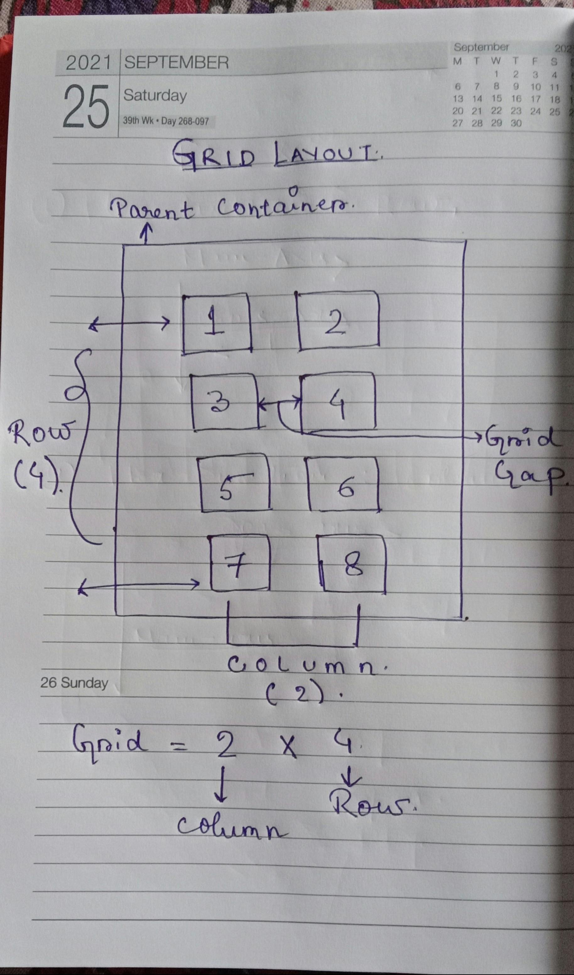
Do you see all those small blocks named 1-8?
Yes. Those little ones. They are referred to as grid elements or grid children. Why? Because they are contained inside of the big parent container.
Did the term make sense, now? 🤔
Today's short blog will be about the things we can do to style the grid elements inside the container.
Let us get to it. I will keep it really really short.
Styling Grid Elements.
You can do a lot to style individual grid elements. Combines with other css properties, you unlock a whole different superpower.
But, using grid properties to style grid elements enables you to specify the position of an element in the grid row or column. That means you have complete control over the view and feel.
1. Span your grid item.
With grid, you can define and specify the position of a grid element. That is you can specify how many columns or rows will it take as per the required design. Isn't it great! 😍
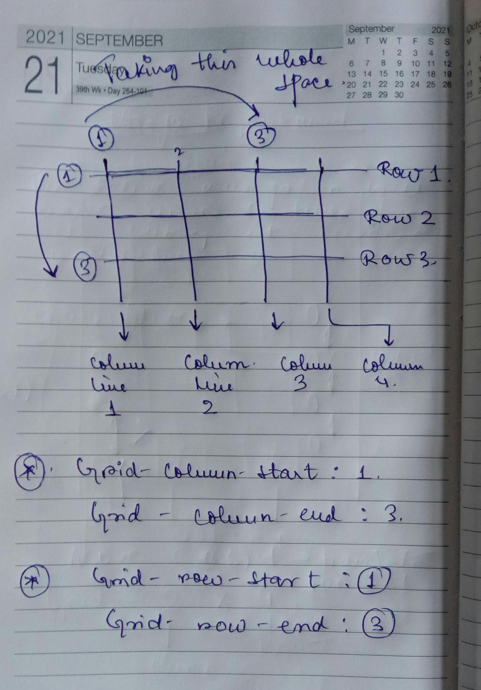
grid-column-start | grid-column-end: This property specifies the start position and end position of an element inside a grid, spanning across the column.
grid-row-start | grid-row-end : yes, you guessed it perfectly fine. These properties positions element inside a grid container, spanning across the rows. By specifying the start row line and end row line.
Syntax:

.item-1 {
  grid-column-start: 1;
  grid-column-end: 3;
  grid-row-start: 1;
  grid-row-end: span 2;
}
Have trouble wrapping it around? refer to the above picture. I will also link resources here. You can check them out too.
grid-column : This is the short hand property of grid-column-start & grid-column-end.
grid-row : this is the shorthand peorperty of grid-row-start & grid-row-end.
Syntax :

.item-1 {
  grid-column: 1 / span 2;
  grid-row: 1 / 2;
}
- grid-area: This is the shorthand property of grid-row-start , grid-column-start , grid-row-end , grid-column-end.
Syntax:

grid-area : grid-row-start / grid-column-start / grid-row-end / grid-column-end;

grid-area : 1 / 1 / 2 / 3;
2. justify-Self
This property helps in aligning a grid item inside a cell along the row axis(i.e, X-axis)
It takes four possible values :
- start : Aligns the grid element at the start of the row axis.
- end : Aligns the grid element at the end of the row axis.
- center : Aligns the grid element at the center of the row axis.
- stretch : Stretched the grid element across the row axis, to take up the maximum possible space.
3. align-self
As opposed to justify-self, This property helps in aligning a grid item inside a cell along the column axis(i.e, Y-axis)
- start : Aligns the grid element at the start of the column axis.
- end : Aligns the grid element at the end of the column axis.
- center : Aligns the grid element at the center of the column axis.
- stretch : Stretched the grid element across the column axis, to take up the maximum possible space.
4. place-self
This property is shorthand for align-self / justify-self. That means, by using this property you can specify both the directions while sizing an item inside a grid cell.
.item1 {
place-self : start  center ;
}

/*
can you guess how will it be aligned?
The above code essentially means ,
align-self : start;
justify-self : center;

easy?
*/
That is it pretty much it for today's blog. I tried to keep it as short as possible with some of my hand notes for better comprehension.
Links to other resources and WEB IDE to practice by playing.
- css-tricks is one of the best platforms to learn more about css grids and css together! 💕 Read on css-tricks
- Freecodecamp is one of the OGs in providing the best information. 💕😍
- freecodecamp blog
- freecodecamp youtube
- w3schools is another great resource to learn from. What's best, is they also provide their own web IDE for you to play and have fun while learning. 😍 w3schools
We have covered the basics of the Web, so far. If you missed any in the series, feel free to check out : [My Blog Series : to master Web Dev](dwaipayan.hashnode.dev/series/master-web-de..)
Keep building. Keep learning. Have a wonderful weekend ahead. 🎅